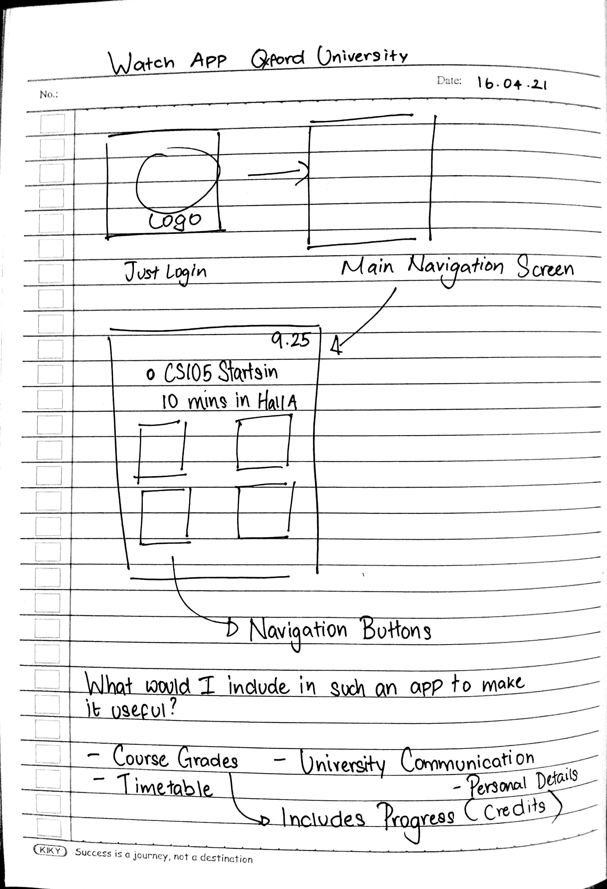
This is actually an interesting idea that I got through a Sharpen prompt. Initally, I was a little skeptical about getting started with this project as I have never designed a visual appearance and interaction for a wearable device. I then told myself, "If I don't try to design one now, I will be limiting myself and I'll consider this an experiment to see how well I do it and whether I like doing it at all." and I started to sketch out the application on paper.
The goal of the project is simple. This is a Watch-based application for students who attend Oxford University. I had to decide what goes into such an application as it should be direct and easy to understand and use. After thinking for a while, I decided that the app will have 4 main features. Viewing their class timetable, their grades, University communication and finally, their University profile containing details such as their Student ID Number, Date of Birth, etc.
The main struggle stemmed from the fact that I have never used a wearable device before. Because of this, I had trouble figuring out how small or large the text should be to make it readable, the colours that I should use and even the size of the buttons. After looking at a few examples of existing Watch Apps, I got a rough idea but nothing concrete.
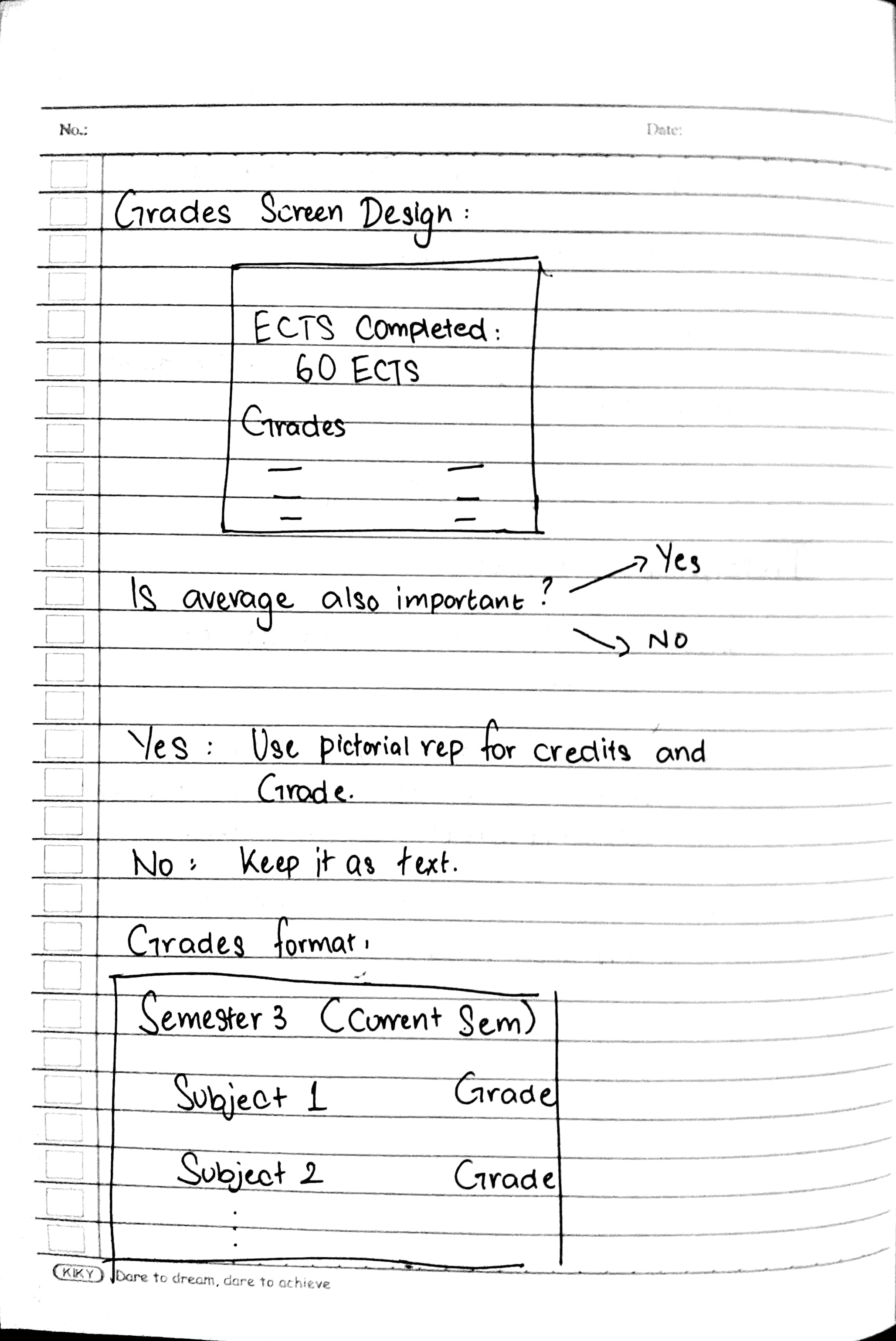
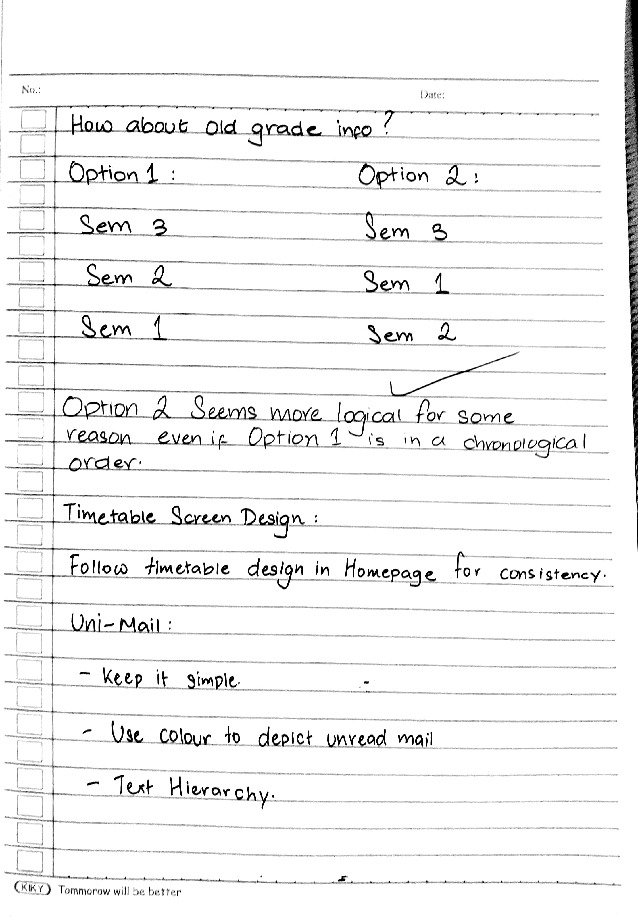
After making a few sketches about how the buttons should be positioned and how the navigation is structured, I got a better idea on how to progress. I decided that I was going to prototype 3 features from the aforementioned list. The Grades, Timetable and E-Mail as logically, these 3 features will be the most used one by the students.
Sketches and Brainstorming Session while making the designs
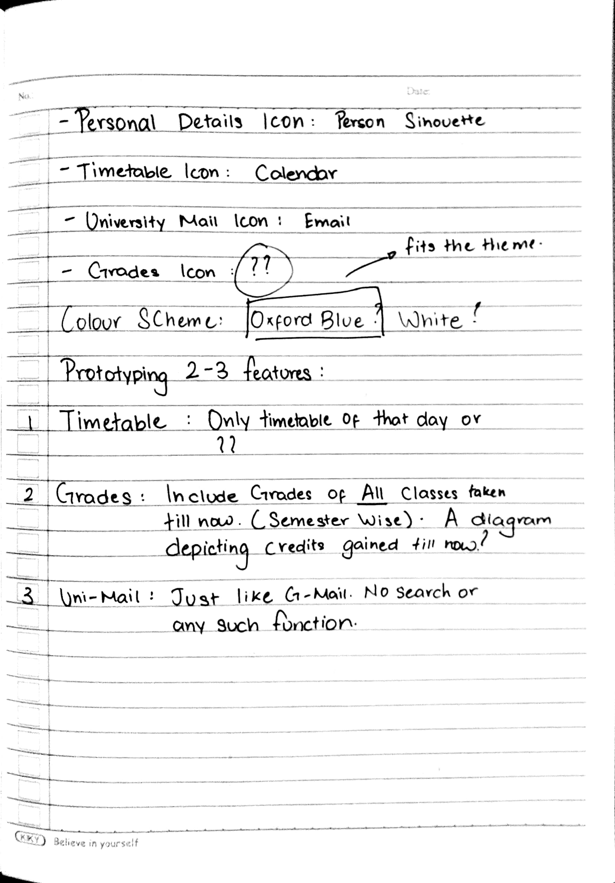
After this brainstorming session, I moved on to creating the High-Fidelity prototype on Figma. I chose Oxford Blue as the base colour of this application since it is the official colour of University of Oxford. Then I just Coolors, a Colour Palette Generator to get fitting colours for the rest of the application such as the Greens for the Progress Bars, the Reds for Notifications and other colours I could use.
Conclusion
I had a lot of fun working on this project. Most importantly, I learnt how to design interactions for Smart Watches! I wanted the application to have a clean look to it as people only tend to look at their watch for a few seconds. I mainly concentrated on the usability of this application. I wanted users to understand the timetable and the mail communication in a very short amount of time.
I hope you liked my project! Thanks for reading it and if you have any feedback, please don't hesitate to contact me.
