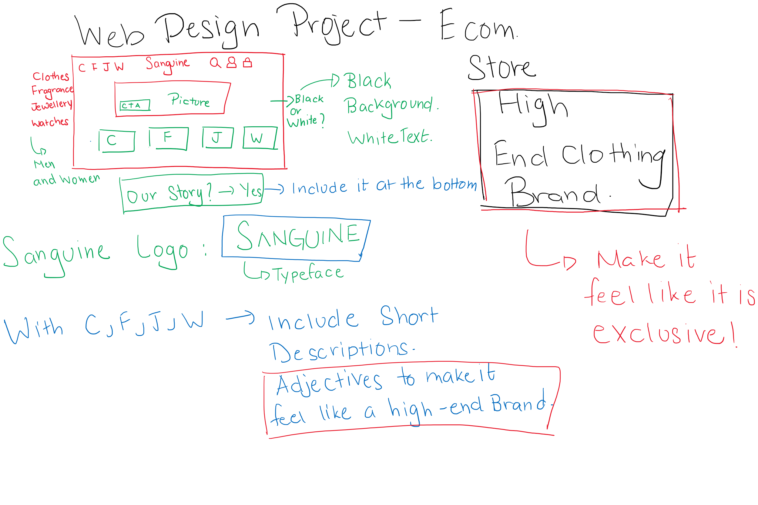
Brainstorming Process
Just to get an initial idea of what I want the website to feel like, I created a sketch of what information I want to include in the landing page, the colour scheme of the website and the logo of Sanguine.
P.S: I got a new Graphics Pad and I just wanted to try using it for this brainstorming process. In the end, I am pretty happy with the end result.
Defining the Users of the Website and it's Scope
I expect the users of this application to be people interested in high-end clothing brands to exhibit their status and also, the modelling agencies who work with Sanguine. Since this is more expensive than your average fashion brands, I expect the number of users to be lesser than your average fashion brand.
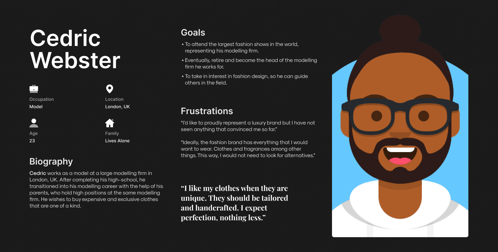
Meet the users of Sanguine
Based on the previous section, I have illustrated a prospective user persona for the Sanguine Website. Due to budget constraints, this user persona is only a depiction of one of the few possible users of the Sanguine Wesbite.
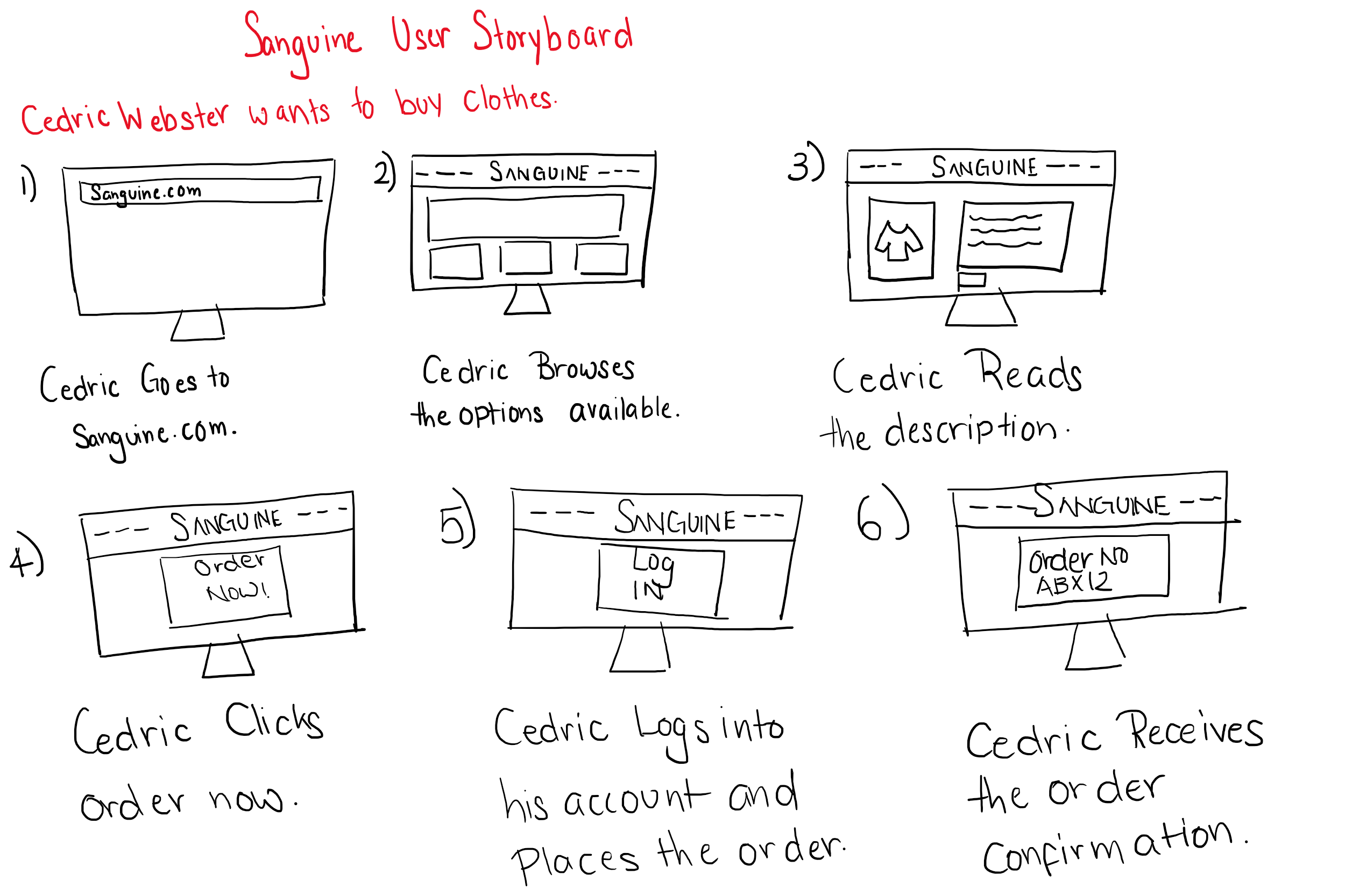
Cedric Webster User Storyboard - Using the Sanguine Website to Buy Clothes.
To get a better understanding about how the users would traverse through the Sanguine Website, I have created a user storyboard of how Cedric Webster would navigate through the application and accomplish his goal of buying clothes using the Sanguine Website.
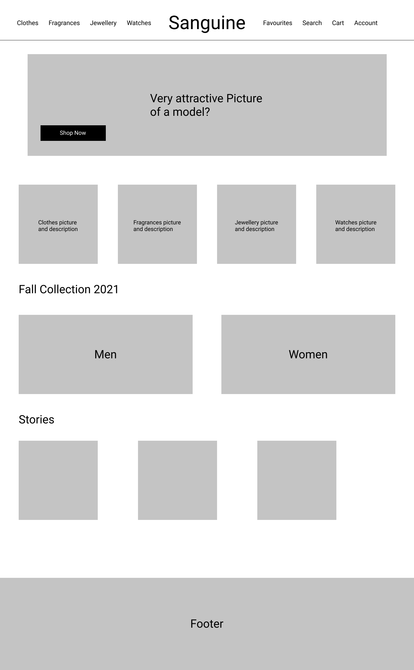
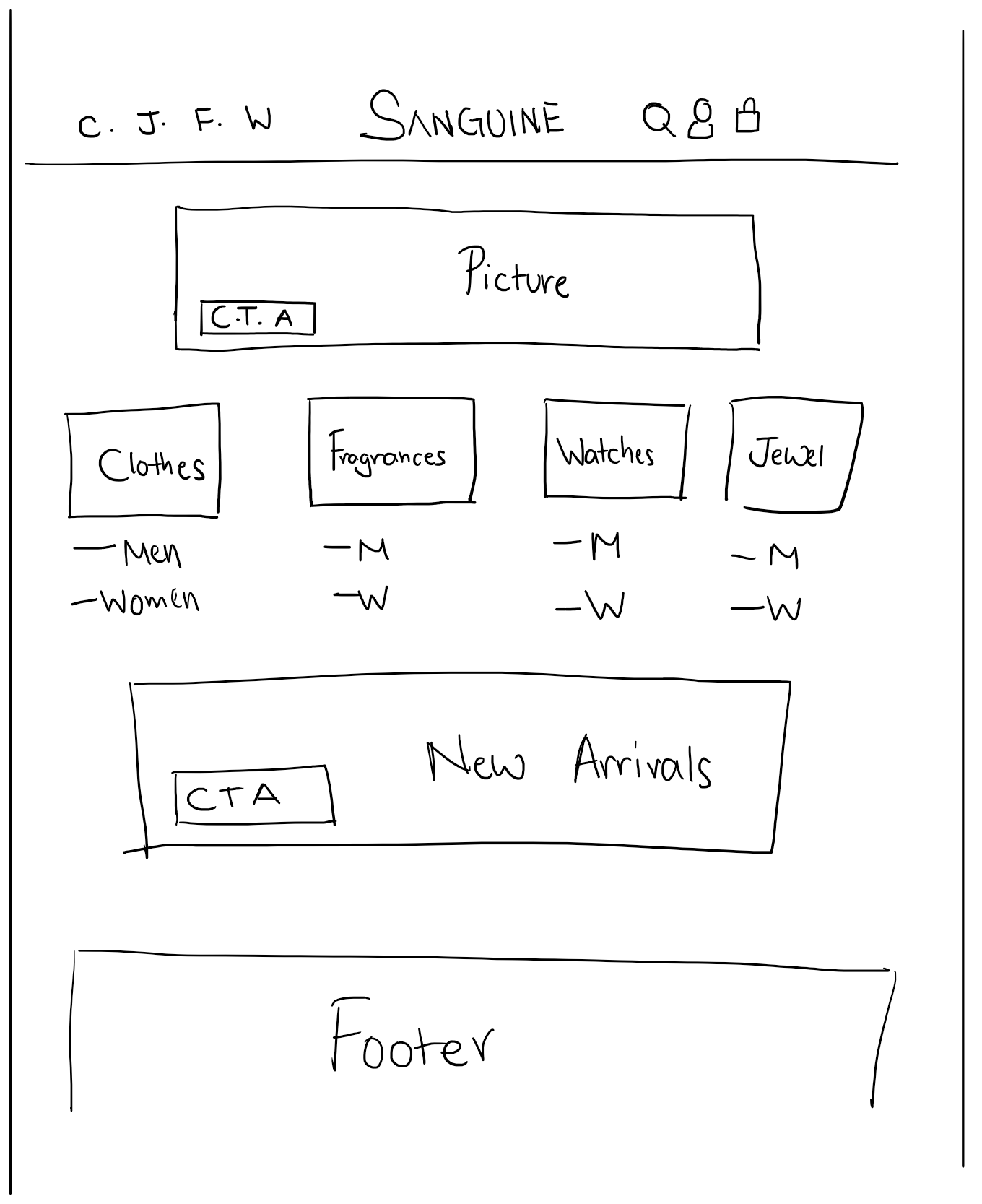
Initial Sketches of the Wireframe
Before I make the wireframes using Figma, I wanted to get a grasp on how the pictures and other navigation options would be arranged in the landing page. In order to illustrate the idea, I have created sketch of the landing page which will serve as a guidance when I design the actual wireframes of the website.
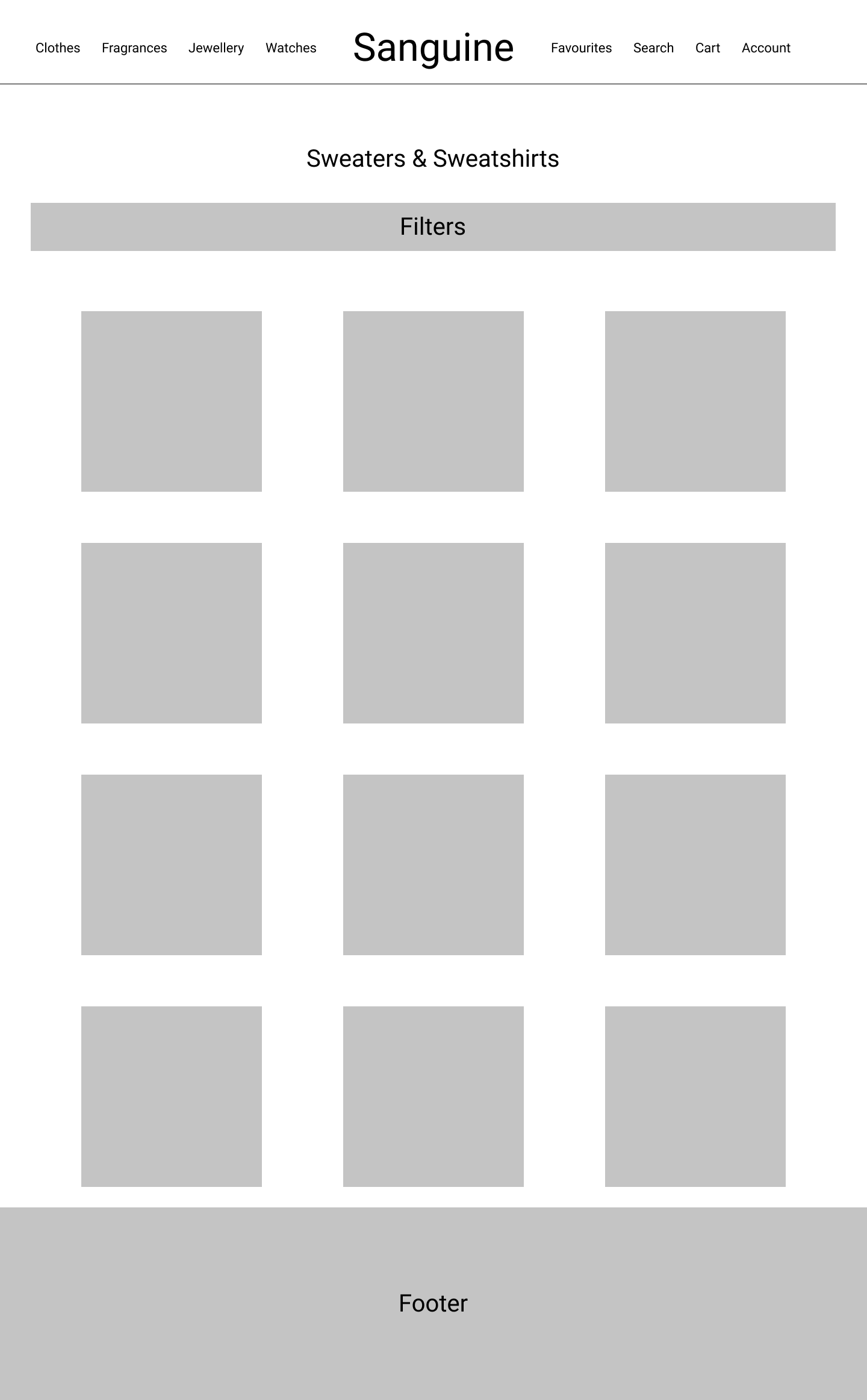
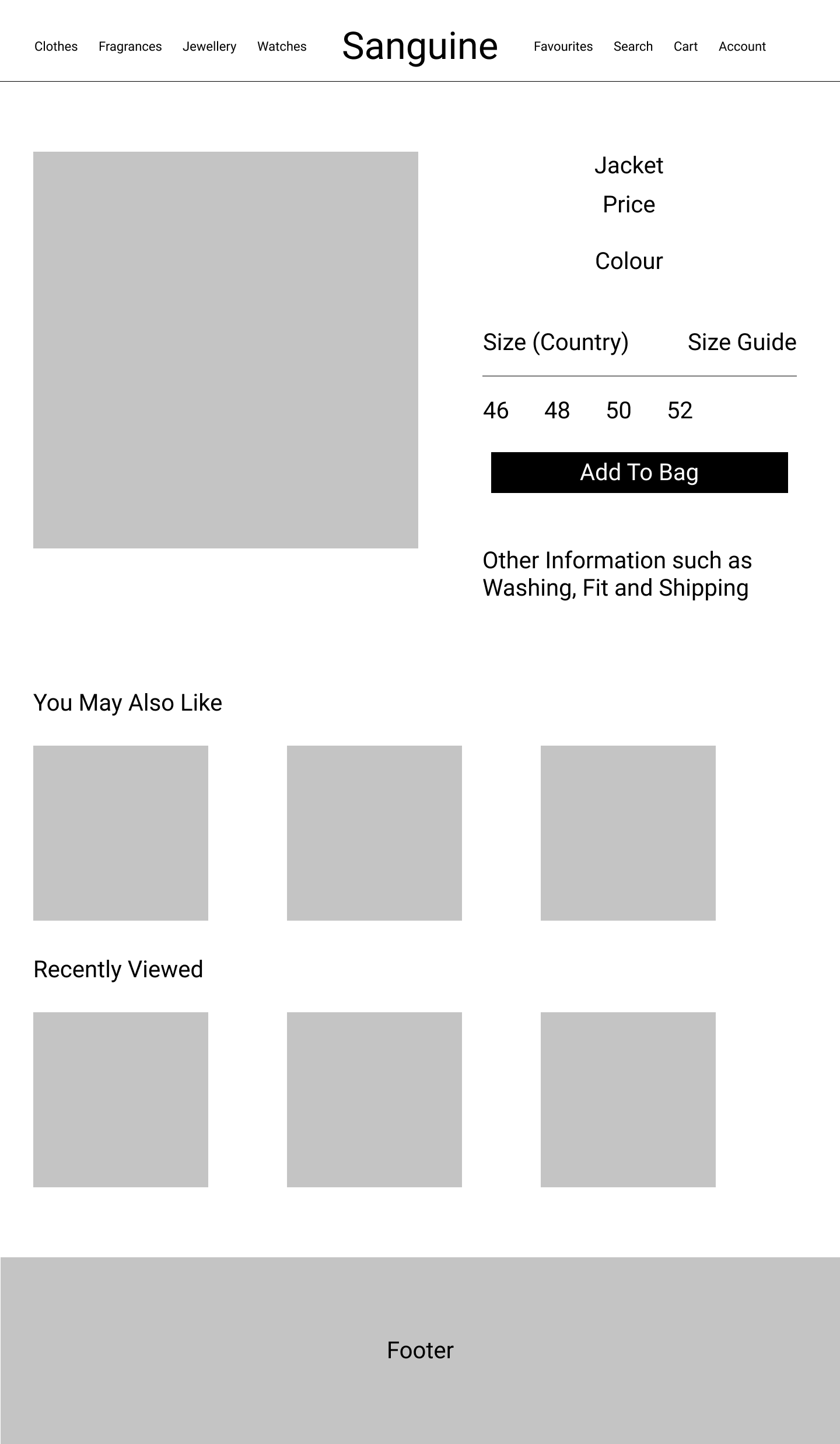
Wireframes
Based on the sketch, I have created 3 wireframes. One for the landing page, one for displaying all items in the catalog and the last one for viewing the information about the product.
My first thought was to figure out a way to optimize the navigation:
A) Having Clothes as the main option in the navigation and when users hover over it, they see Men and Women's options separately. (As indicated in the wireframes).
B) Having Women's Clothes and Men's Clothes as options in the navigation.
When we see examples of other luxury brand websites, we see that Option B is the one that is present. This may be a way to increase conversion as well as improve readability and to reduce clicks. I initially thought Option A could be considered but ideally, given the resources, I would conduct an A/B Testing between the two navigation options which increases the conversion rates.
As far as the high-fidelity prototype is concerned, I will be going for Option B for the navigation because why reinvent the wheel when other Luxury Brands show that this works well.